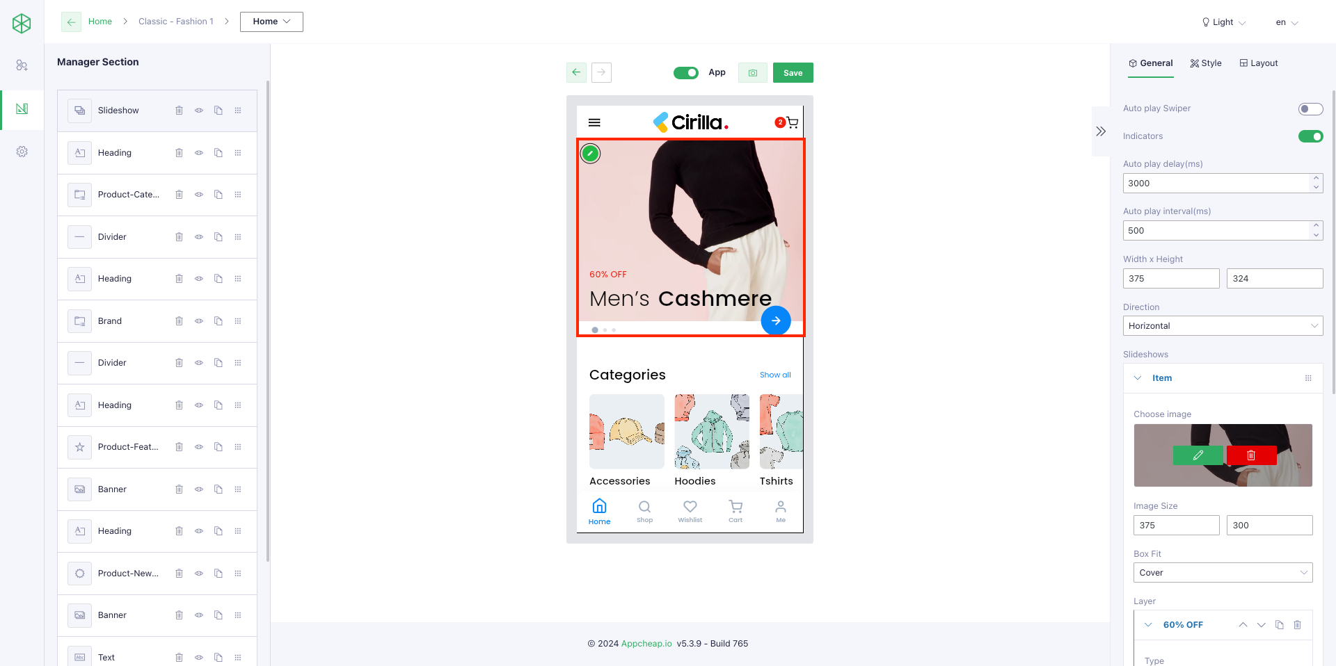
To have a slideshow as expected displays on your app, you should configure it first on the Backend panel by: Go to Admin panel > choose [App Builder] > Select a template that you want to update > Choose option [Home] on the dropdown refer here > Drag Slideshow widget into the builder.
1. Layout:
For this widget, users can insert a slideshow into their Homepage with 5 layouts: Basic, Center mode, Stack, Tinder, Rotate on “Layouts” tab.
2. General configuration:
On “General” tab, users can customize their slideshow with many options:
| Autoplay Swiper | Yes: the slideshow will be played automatically No: autoplay will be disabled. |
| Indicators | Show/hide indicators |
| Autoplay delay(ms) | Setting delay time (ms) It is only effective when “Autoplay Swiper” = Yes |
| Autoplay interval(ms) | Setting interval time to autoplay It is only effective when “Autoplay Swiper” = Yes |
| Width x Height | Setting width/height for slideshow image Default is 375 x 330 |
| Direction | There are 2 options: Vertical and Horizontal – Vertical: the slideshows will move vertically (up – down) – Horizontal: the slideshow will move horizontally (right – left) |
3. Content block
For this section, please note that:
– Each item is corresponding to a slideshow (refer here).
– Each element on the slideshow is corresponding to a layer item (refer here).
– A slideshow item can have 1 or many layer items (refer here).
– For each layer item, there are 4 types: Text, Button, Image, Icon to select (refer here).
| Config for Slideshow item | |
| Choose image | Select an image for slideshow |
| Image size | Set width x height for the image |
| Box fit | Set how the image is displayed |
| Config for Layer item | |
| Type = Text | Users are able to: – Set position for the text on the slideshow – Set Text content – Set an action when customer click on the text (Action field – pls refer to https://appcheap.io/docs/app-builder-user-guide/widget-catalog/input-action/ for more detail to set up) |
| Type = Button | Users are able to: – Set position for the button on the slideshow- Set button name (Text field) – Set background color, button color, button border width, button size, button border radius – Set an action when customer click on the button (Action field – pls refer to https://appcheap.io/docs/app-builder-user-guide/widget-catalog/input-action/ for more detail to set up) |
| Type = Image | Users are able to: – Set position for the button on the slideshow – Text field: to name for the button, will not show on the slideshow. – Select an image to show – Set image size – Set an action when customer click on the button (Action field – pls refer to https://appcheap.io/docs/app-builder-user-guide/widget-catalog/input-action/ for more detail to set up) |
| Type = Icon | Users are able to: – Set position for the Icon on the slideshow – Text field: to name for the icon, will not show on the slideshow. – Select an icon to show – Set icon color, icon size – Set an action when customer click on the button (Action field – pls refer to https://appcheap.io/docs/app-builder-user-guide/widget-catalog/input-action/ for more detail to set up) |
| Position (refer here) | – Left, Top, Right, Bottom: set a distance between the current layer item (text, image, button, icon) and 4 margins. – Width, Height: when users input values for these fields => the system will create a textbox automatically, allows users to enter content only in that textbox (refer here) so users can configure a layer item more quickly. Note: In 3 fields: “width, left, right” or “height, top, button” will always have one of them get disabled, we can’t set 3 fields at the same time. |
| Duplicate a Layer item (refer here) | Click on copy_icon to duplicate the current layer item |
| Move up/down a Layer item (refer here) | Users are able to use this function to set a layer item above another one. Ex: refer here |
| Delete a Layer item (refer here) | Click on delete_icon to remove the current layer item |
4. Style configuration
On “Style” tab, users can set up: padding, margin, animation, Background Section, Indicator color, Indicator Active color.
5. Some examples for slideshow
5.1. Example 1
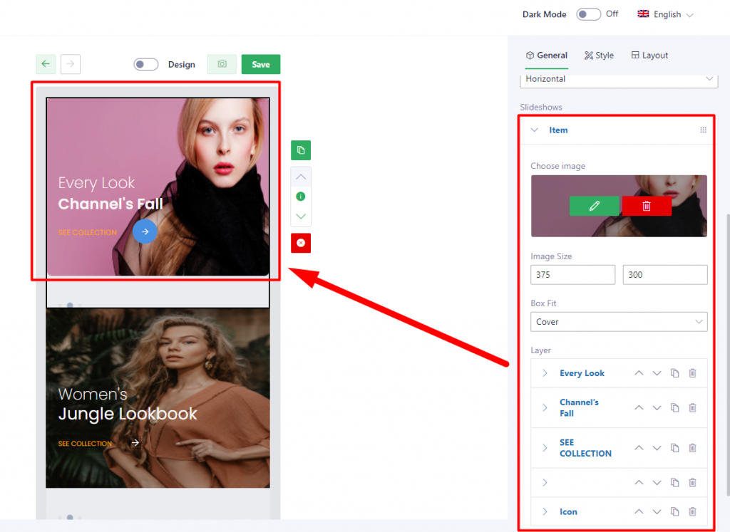
If you wanna create this slideshow, you can follow these setup below:
Step 1: Create a slideshow item refer here
Step 2: Create 5 layers:
| Layer 1 | Type: Text | refer here |
| Layer 2 | Type: Text | refer here |
| Layer 3 | Type: Text | refer here |
| Layer 4 | Type: Button | refer here |
| Layer 5 | Type: Icon | refer here |
5.2. Example 2
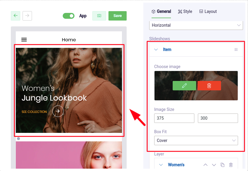
If you wanna create this slideshow, you can follow these setup below:
Step 1: Create a slideshow item refer here
Step 2: Create 5 layers:
| Layer 1 | Type: Text | refer here |
| Layer 2 | Type: Text | refer here |
| Layer 3 | Type: Text | refer here |
| Layer 4 | Type: Button | refer here |
| Layer 5 | Type: Icon | refer here |
5.3. Example 3
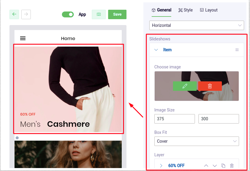
If you wanna create this slideshow, you can follow these setup below:
Step 1: Create a slideshow item refer here
Step 2: Create 3 layers:
| Layer 1 | Type: Text | refer here |
| Layer 2 | Type: Text | refer here |
| Layer 3 | Type: Text | refer here |
5.4. Example 4
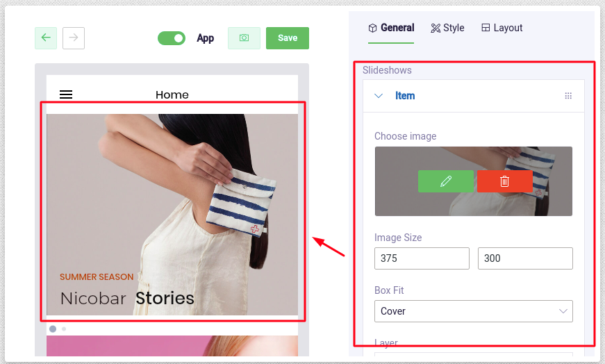
If you wanna create this slideshow, you can follow these setup below:
Step 1: Create a slideshow item refer here
Step 2: Create 3 layers:
| Layer 1 | Type: Text | refer here |
| Layer 2 | Type: Text | refer here |
| Layer 3 | Type: Text | refer here |
5.5. Example 5
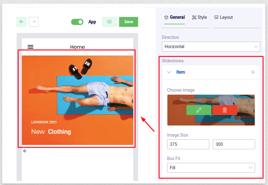
If you wanna create this slideshow, you can follow these setup below:
Step 1: Create a slideshow item refer here
Step 2: Create 3 layers:
| Layer 1 | Type: Text | refer here |
| Layer 2 | Type: Text | refer here |
| Layer 3 | Type: Text | refer here |