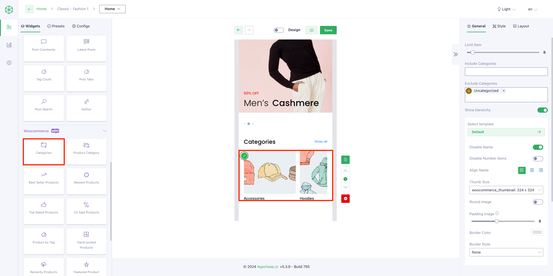
1. General tab
| General | |
| Limit item | Allow users to input number of categories that will be shown on App |
| Includes | Limit result set to specific category. |
| Exclude | Ensure result set excludes specific category |
| Show hierarchy | Show/hide sub-categories |
| Select template | There are 4 templates that users can use for their categories: – Item default – Item overlay – Item background wrap – Item image & text horizontal |
| Disable name | Display categories name |
| Disable number items | Display categories number items |
| Align name | Alignment the element: Left, center, right |
| Thumb size | Whenever you upload an image, WordPress automatically creates different image sizes. In some case you lose one of them and the app can’t display you can chose other in App builder plugin. |
| Round image | Display round/square category image |
| Padding image | Create a surround distance between the image and the frame |
| Border color | Set color for border |
| Border Style | There are 4 styles that users can use for their border: – Dotted – Solied – Dashed – None |
| Padding/Margin | Set Padding/Margin for whole section |
| Background color | Set background for category list |
| Padding item | Set distance among category items |
| Height | Set hight for category list Note: Only use when layout is carousel or slideshow |
| Height image | Set hight for category list Note: Only use when layout is carousel or slideshow |
| Config Item | |
| Background Item | Set background for each item |
| Text color | Set text color for item |
| Border radius | Set radius for each item |
| Border radius image | Set radius for item image |
| Font size Item | Set text font size for item |
| Subtext color Item | Set subtext color for item (count item, show all) |
2. Layout tab
| List | The category will be displayed as a list |
| Carousel | The categories will be displayed as a carousel Note: For this layout, users should config [Height] on Style tab to show name/label clearly |
| Masonry | Masonry layout is a layout method where one axis uses a typical strict grid layout, of most often columns, and the other a masonry layout. refer here |
| Big first | The categories will be displayed as a big first. |
| Slideshow | The categories will be displayed as a slideshow. |
| Grid | The categories will be displayed as a grid. Note: users can config number of column at field [Column] on Style tab. AND use [Ratio] to set up the height of the block refer here |