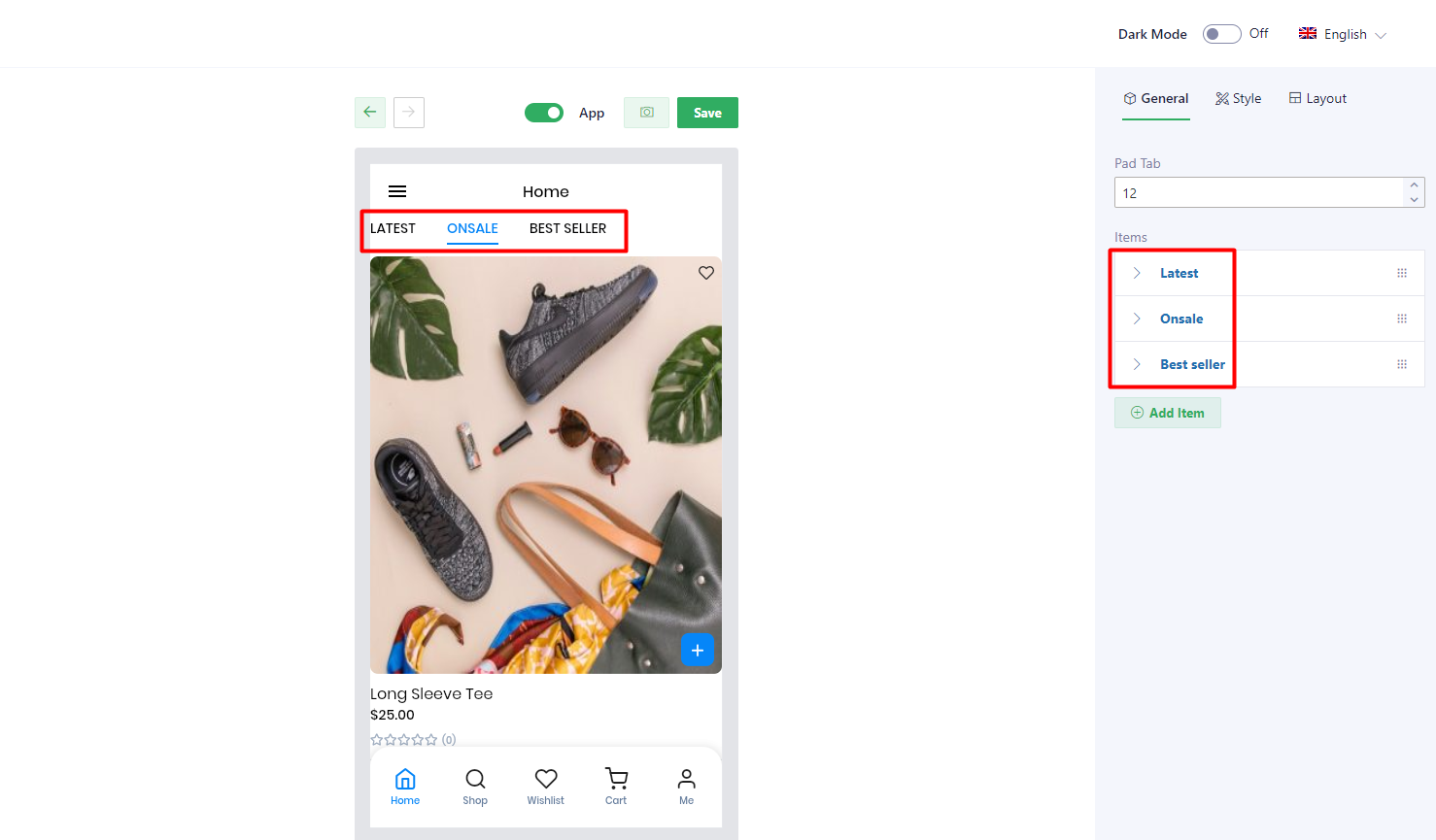
For this widget, users are able to create as many tabs as they want. Each tab will be corresponding to an item refer here.
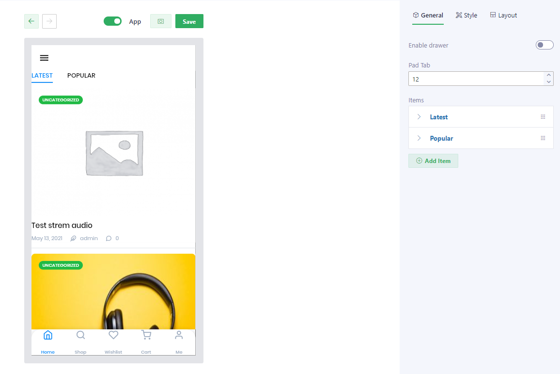
1. General tab
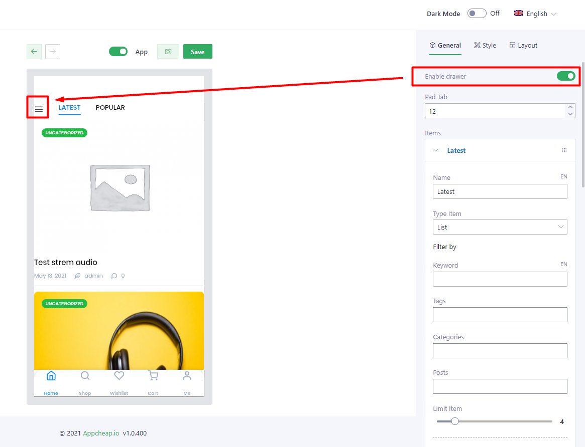
| Enable drawer | Show/hide Drawer (sidebar icon) refer here |
| Pad tab | Setting padding for this section |
| Items | Users are able to create as many tabs as they want |
| Name | Set name for the tab |
| Type item | There are 6 types that users can choose: list, carousel, masonry, big first, slideshow, grid. |
| Filter by | |
| Keyword | Users can input a keyword into this field, so the posts that have name/description is mapping with this keyword will be shown. |
| Tags | Users can filter posts by tags by choosing 1 or multiple tags (by clicking Shift + select tag) |
| Categories | Users can filter posts by category by choosing 1 or multiple categories. |
| Posts | Users can filter products by selecting one by one on this field. |
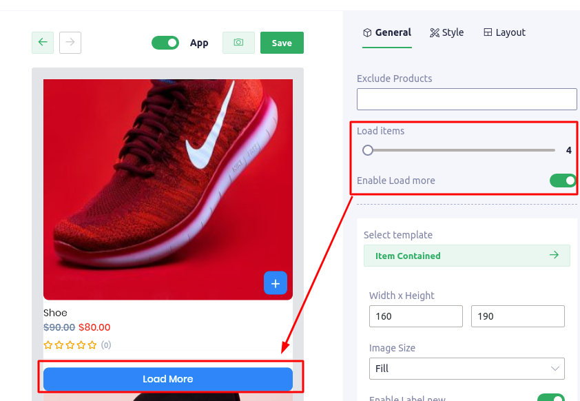
| Load items | Limit product number will be shown on App |
| Enable Load more | Example: – Setting [Load items] = 4 – Setting [Enable load more] = Yes – Total Posts = 10 ————————————————————– On App, the Posts block will only show 4 first products and a [Load more] button (refer here). If user click on [Load more] button, the next 4 products will be shown and [Load more] button still show below them. |
| Select template | There are 10 templates that users can use for their products: – Item default – Item horizontal – Item vertical – Item vertical center – Item number – Item image overlay – Item timeline – Item top name – Item Emerge – Item gradient |
| Width x Height | Setting the size to product block |
| Image size | Users can choose 1 in 7 size types to show product image |
| Excerpt Category Date Author Comment count | Setting to show/hide each element |
2. Style tab
| Config Section | |
| Padding/ Margin | Set Padding/Margin for whole section |
| Background color | Set background color for the section |
| Pad item | Set padding for each product item |
| Divider with Divider color | Setup width and color for the divider that separate product items |
| Config item | |
| Background color | Set background color for post item |
| Text color | It applies for post name |
| Subtext color | It applies for Date, Author, Comment count |
| Label color | Set color for category label |
| On label color | Set color for category name text |
| Border radius | Set border radius for the post image |
| Border radius label | Set border radius for Category label |
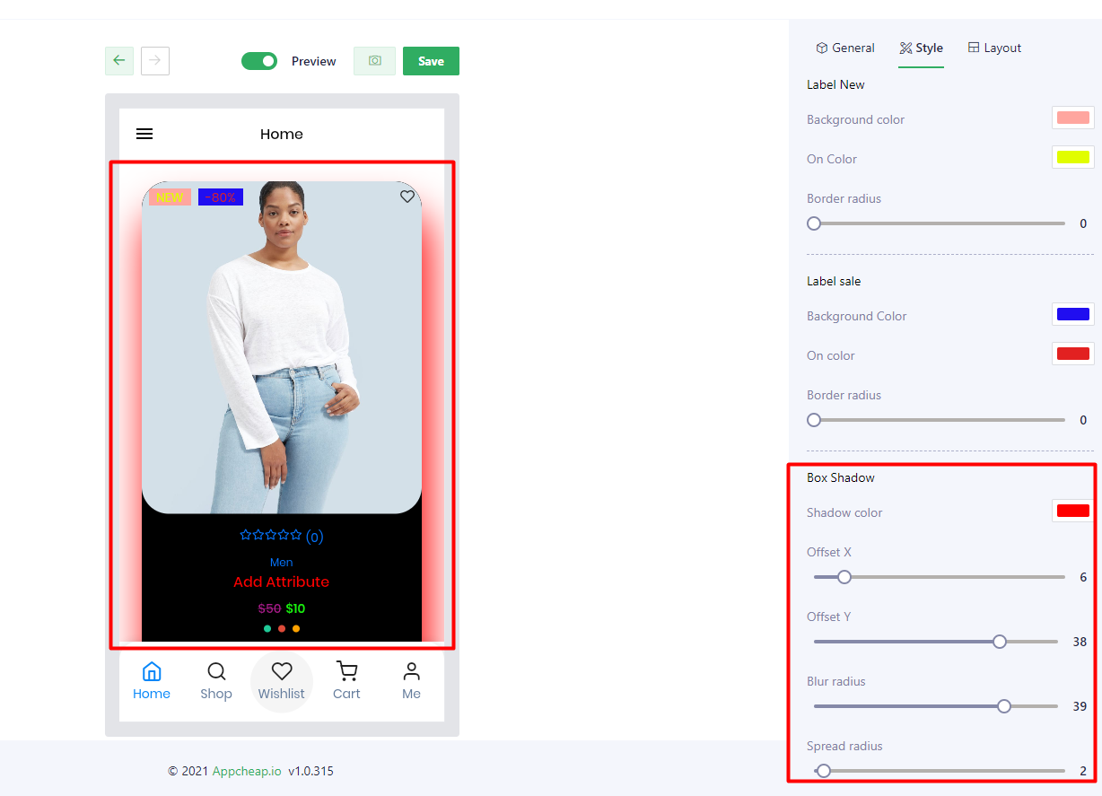
| Box shadow | Users are able to set up shadow for their product block with: Shadow color, Offset X, Offset Y, Blur radius, Spread radius refer here |
3. Layout
There is only 1 available layout to users can use. It is Horizontal.