For this part, users can create a heading for Homepage with 4 layouts: Default, Divider, Corner and Vertical.
| General | |
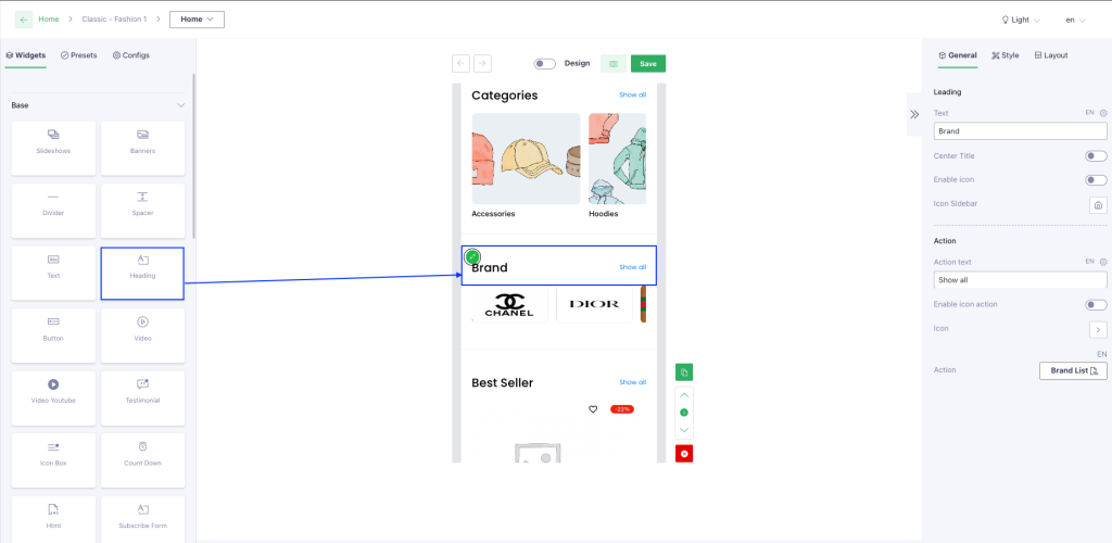
| Leading | This section is to set up displaying for the text that is on the left: Text, Center title, Enable icon, Icon sidebar |
| Action | This section is to set up displaying for the text that is on the right: Text, Enable icon, Icon sidebar |
| Style | |
| General | Set Padding, Margin, Background color for the section |
| Divider | – Divider color: set color for the divider – Divider height: set height for the divider Note: 2 fields should be used for only Divider layout. |
| Border radius | Border Radius Top LeftBorder Radius Top RightBorder Radius Bottom LeftBorder Radius Bottom Right=> users are able to set up Border radius for each corner Note: 4 fields will be applied for only Corner and Vertical layouts. |
| Layout | |
| Select layout | There are 4 layouts that users are able to choose: Default, Divider, Corner and Vertical. |