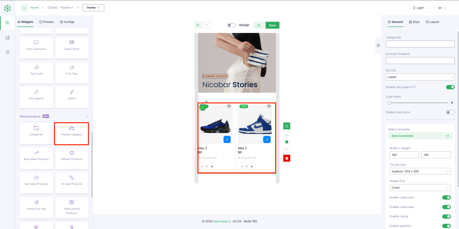
For this widget, users are able to config to display a list of products that belong to a specific or multiple categories.
1. General tab
| Categories | On this field, users can choose 1 or multiple categories (by clicking Shift + select categories) |
| Exclude product | After setting up [Categories] field, users can select 1 or multiple products on this field to make sure they will NOT display on App |
| Enable geo search | – Check have add query products with Geo or not – Used when app is setting location – Used from App builder v4.3.3 |
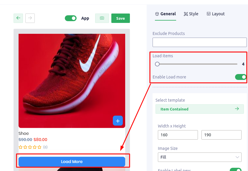
| Load Items | This field allows users to control the product number that will be displayed on App. |
| Enable load more | Example: – Setting [Load items] = 4 – Setting [Enable load more] = Yes – Total products = 10 ————————————————————– On App, the Product Category block will only show 4 first products and a [Load more] button (refer here). If user click on [Load more] button, the next 4 products will be shown and [Load more] button still show below them. Note: this function only applies for layouts: List, Masonry, Grid, Big first. |
| Select template | There are 5 templates that users can use for their products: – Item contained – Item horizontal – Item emerge – Item vertical – Item vertical center |
| Width x Height | Setting the size to product block |
| Image size | Users can choose 1 in 7 size types to show product image |
| Enable label new Enable label sale Enable category Enable rating | Setting to show/hide each element |
| Sort By | Random: products show randomly any time a user opens the app(Required plugin App Builder – Shopping Video Addons) Latest: products are displayed by Latest updated date Preview: Random |
2. Style tab
| Config Section | |
| Padding/ Margin | Set Padding/Margin for whole section |
| Background color | Set background color for the section |
| Pad item | Set padding for each product item |
| Divider with Divider color | Setup width and color for the divider that separate product items |
| Height | Only apply for Carousel layout |
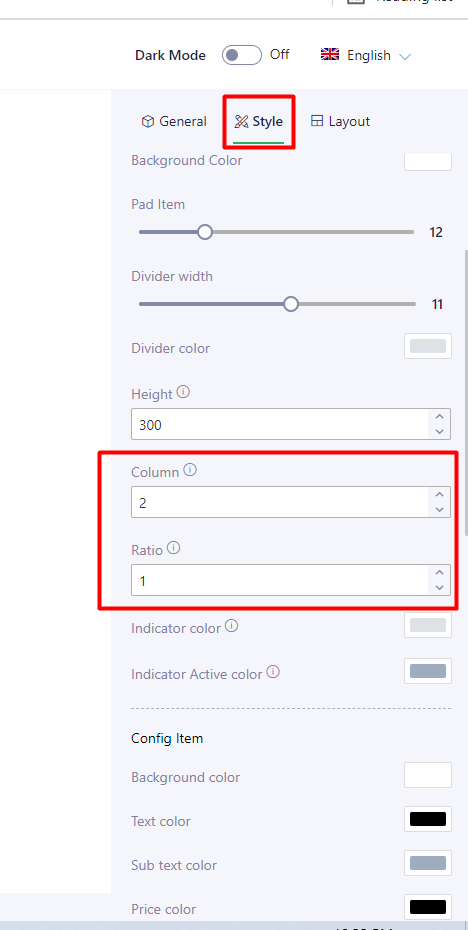
| Column/ Ratio | Set column number and ratio for Grid layout |
| Indicator color Indicator active color | Set color for indicator, only apply for Slideshow layout |
| Config item | |
| Background color | Set background color for product item |
| Text color | It applies for Product name |
| Subtext color | It applies for Category name (if [Enable category] = Yes on General tab) and Rating icon |
| Price color | Set color for price (when price without discount) |
| Sale price color | Set color for sale price |
| Regular price color | Set color for Regular (original) price |
| Border radius Border radius image | Set radius for product item and product image |
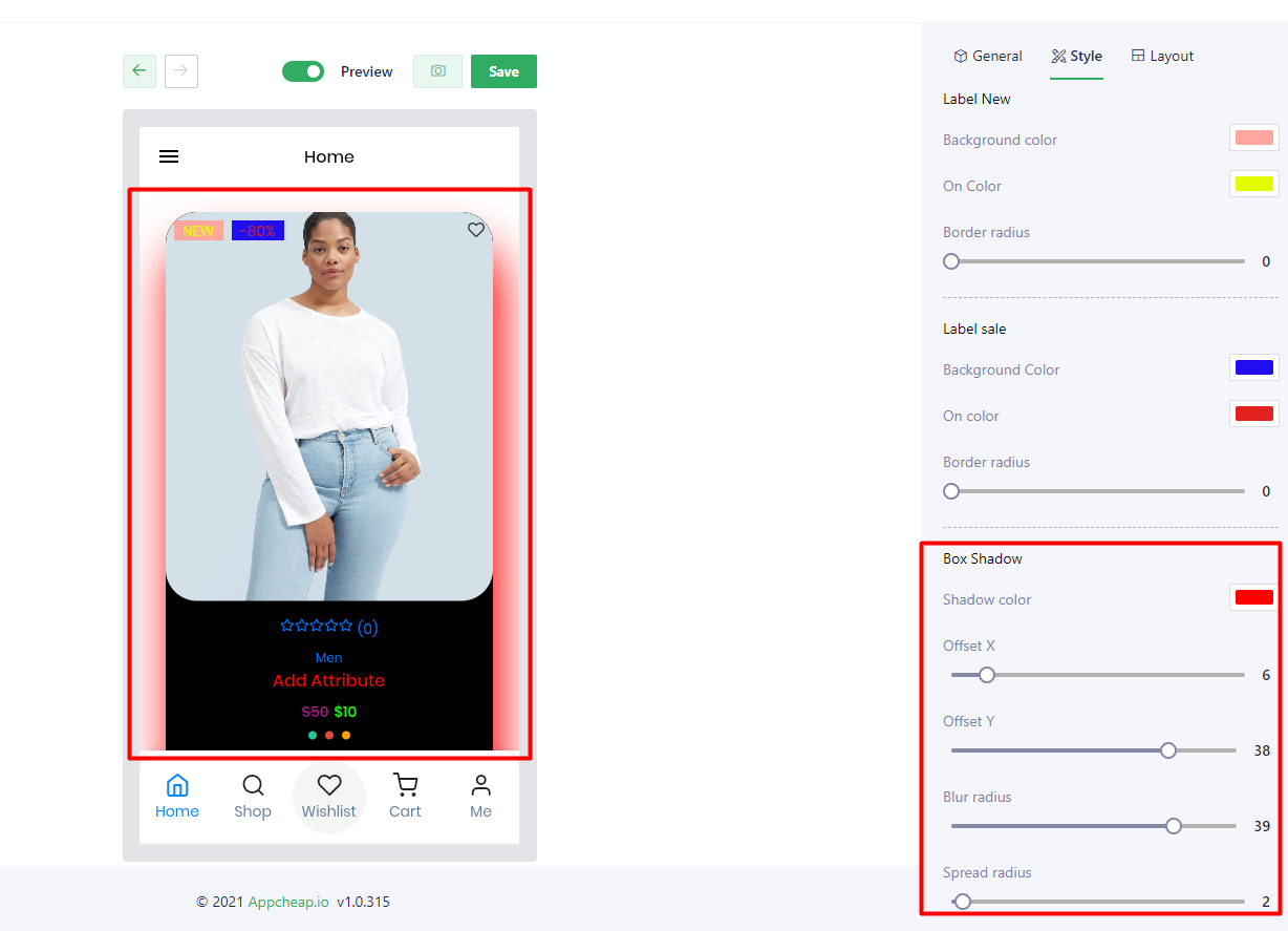
| Label new | Users are able to set: Background color, On color, Border radius for “New” label |
| Label sale | Users are able to set: Background color, On color, Border radius for “Sale” label |
| Box shadow | Users are able to set up shadow for their product block with: Shadow color, Offset X, Offset Y, Blur radius, Spread radius refer here |
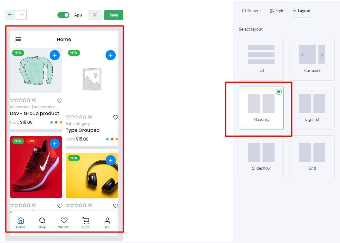
3. Layout
There are 6 available layouts to users can use.
| List | The posts will be displayed as a list |
| Carousel | The posts will be displayed as a carousel Note: For this layout, users should config [Height] on Style tab to show name/label clearly |
| Masonry | Masonry layout is a layout method where one axis uses a typical strict grid layout, of most often columns, and the other a masonry layout. refer here |
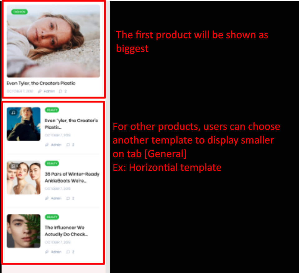
| Big first | The first post will be displayed the biggest on the list. For other posts, users can set another template on General tab. Ex: use template Item Horizontal refer here |
| Slideshow | The posts will be displayed as a slideshow. |
| Grid | The posts will be displayed as a grid. Note: users can config number of column at field [Column] on Style tab. AND use [Ratio] to set up the height of the block refer here |