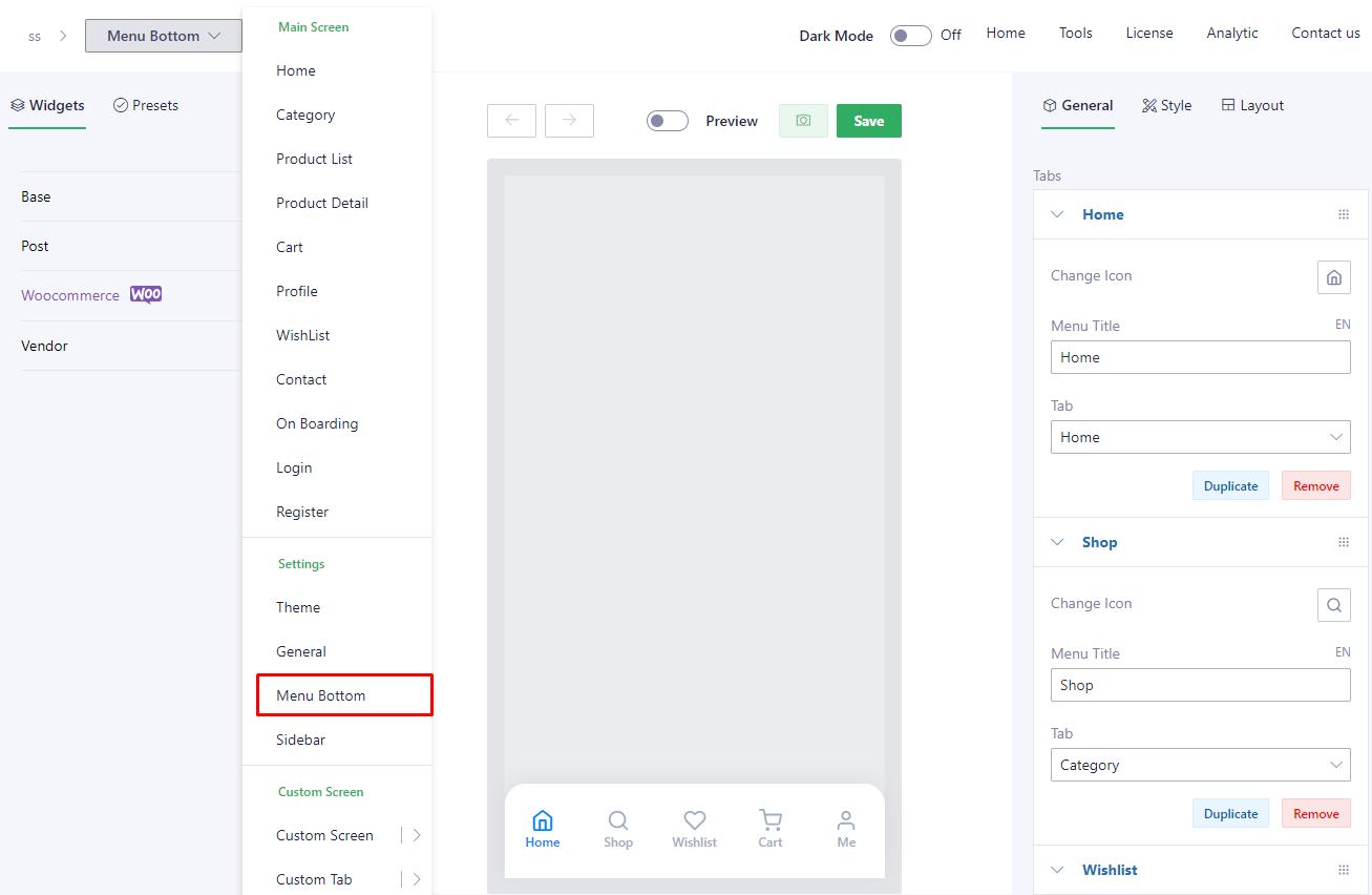
Link to config: Go to Admin panel > choose [App Builder] > Select a template that you want to update > Choose option [Menu Bottom] on the dropdown refer here
Note: don’t setup multiple tabs that share the same screen, because this will lead to unwanted errors.
1. Layout
There are multiple layout templates that users can choose to set up for their app on [Layout] tab
Background

Border Bottom

Border Top

Creative Hexagon

Creative

Default

Fancy Border

Fancy Dot

Floating

Inspired Inside

Floating
Inspired Inside
Inspired Inside Hexagon

Inspired OutSide

Inspired Outside Deep

Inspired OutSide Hexagon

Inspired Outside Deep
Inspired OutSide Hexagon
Inspired Outside Radius

Inspired Top Hexagon

Inspired Top

Salomon

2. General
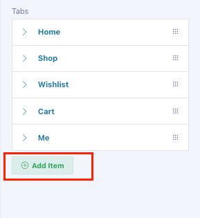
We already have 5 Tabs: Home, Shop, Wishlist, Cart, Me for this section. However, users can totally create or edit tabs as they want by clicking on [General] tab.
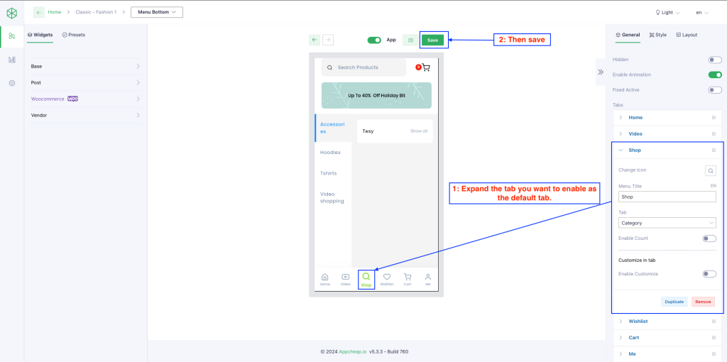
– Edit a tab: For each existing tab, user can edit: icon, title, destination
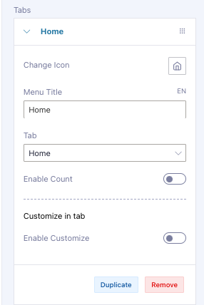
– Add a new tab: They also create a new tab by clicking on [Add item] button then input necessary fields.
– Duplicate / Remove a tab: users are able to duplicate/Remove a tab easily by clicking the corresponding buttons.
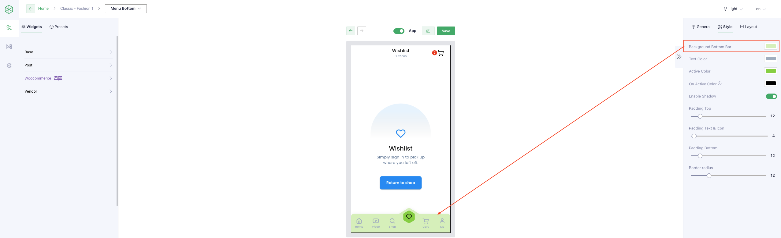
3. Style
| Background Bottom Bar | User can set Background color for this section refer here |
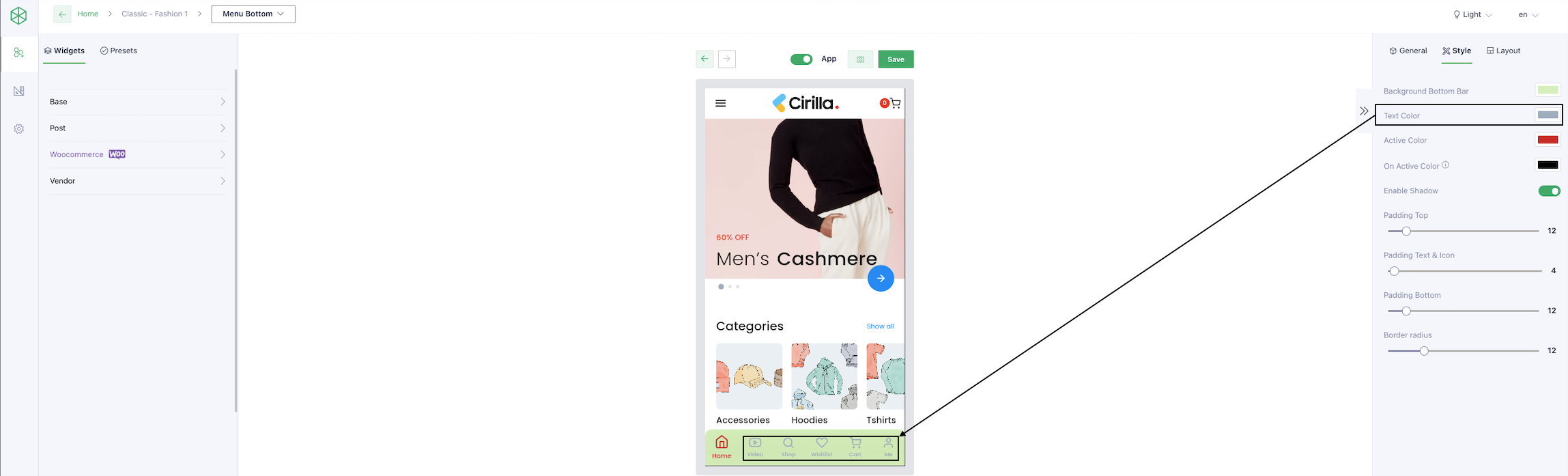
| Text Color | User can set text color for the item refer here |
| Active Color | User can set active color for the item refer here |
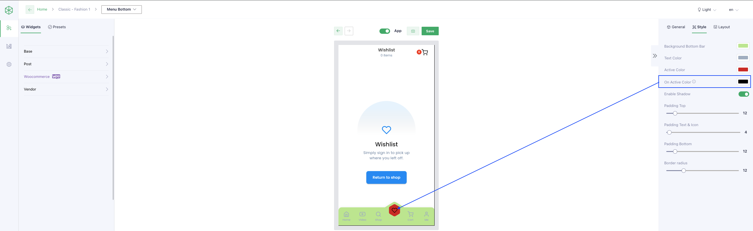
| On Active Color | User can set on active color for the item of layout Salomon Inspired Inside Inspired Inside Hexagon Inspired Outside Inspired Outside Hexago Inspired Outside Deep Inspired Outside Radius Inspired Top Inspired Top Hexagon Creative refer here |
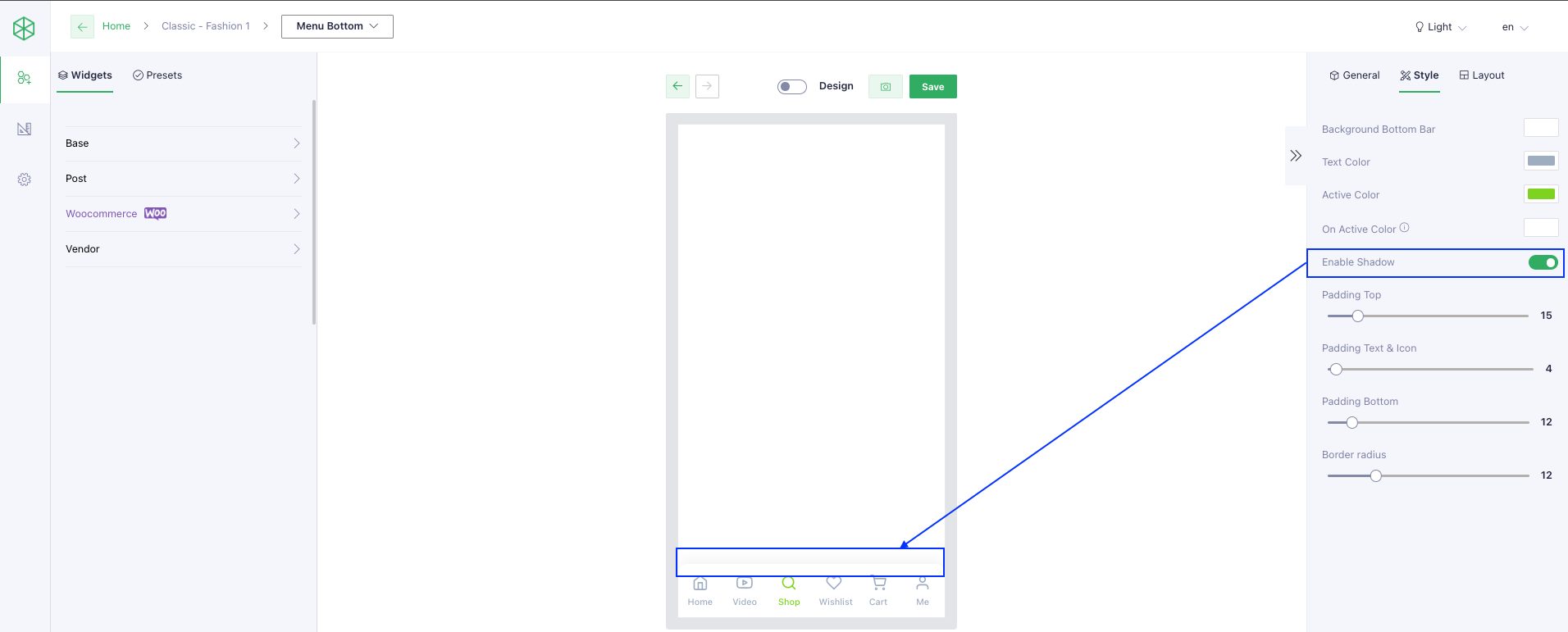
| Enable Shadow | User can enable shadow for the menu bottom refer here |
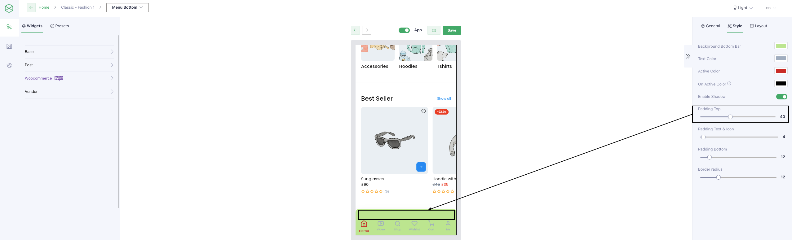
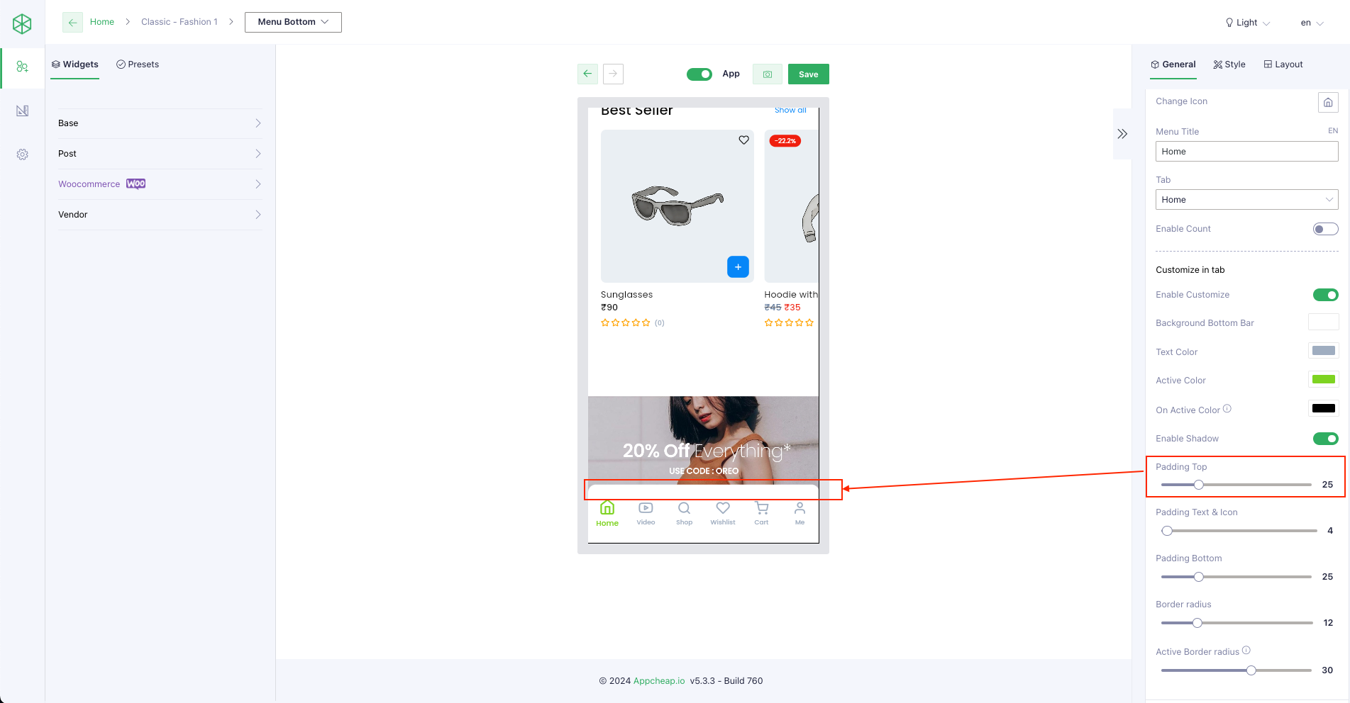
| Padding Top | User can set padding top for the menu bottom refer here |
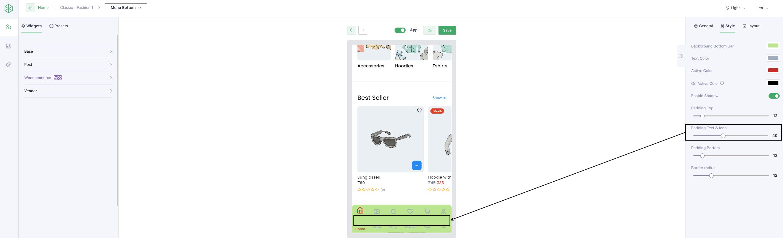
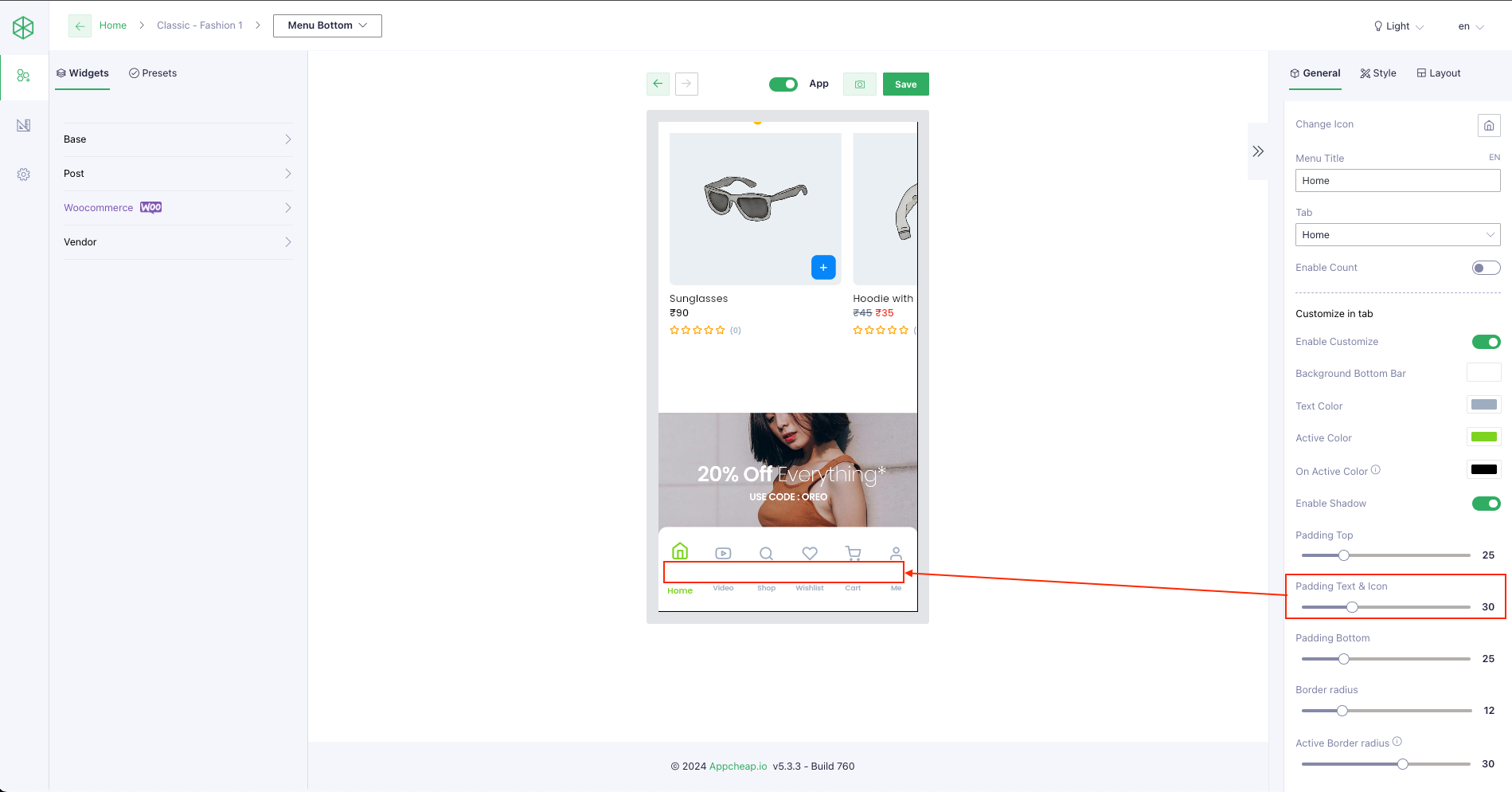
| Padding Text & Icon | User can set padding text & icon for the menu bottom refer here exclude layout “salomon” |
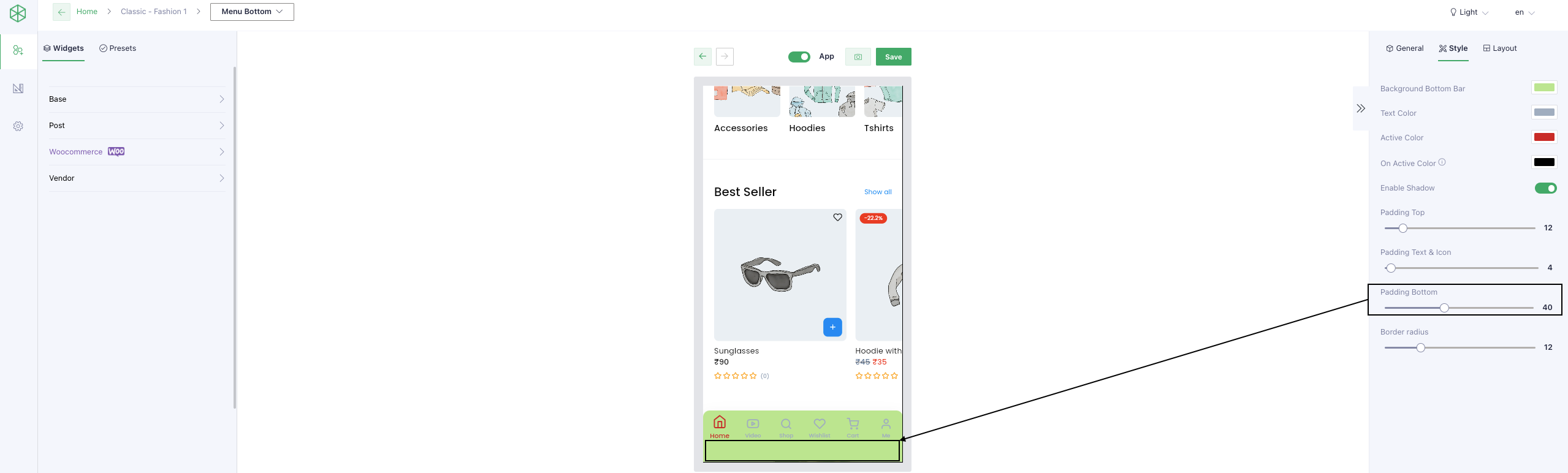
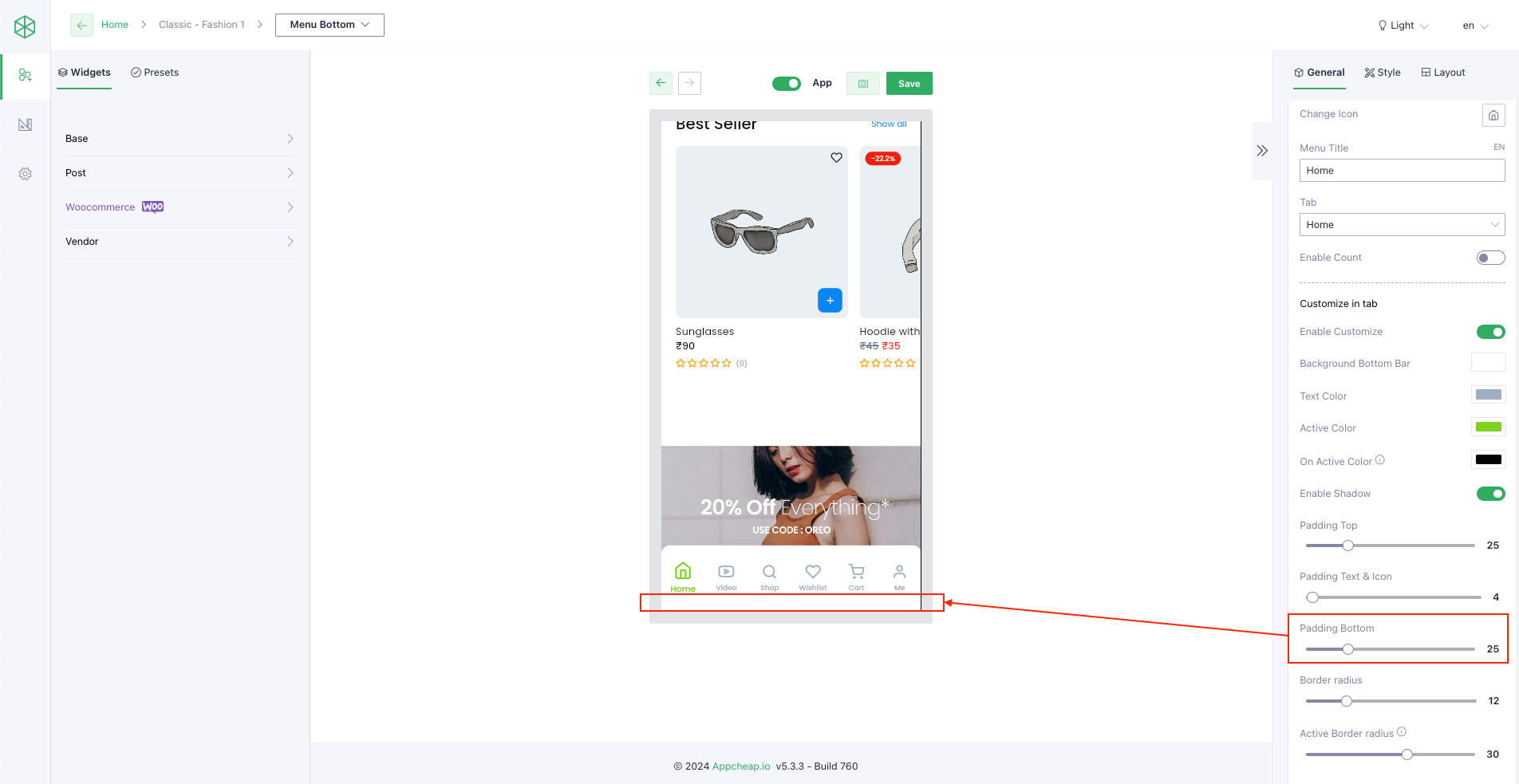
| Padding Bottom | User can set padding bottom for the menu bottom refer here |
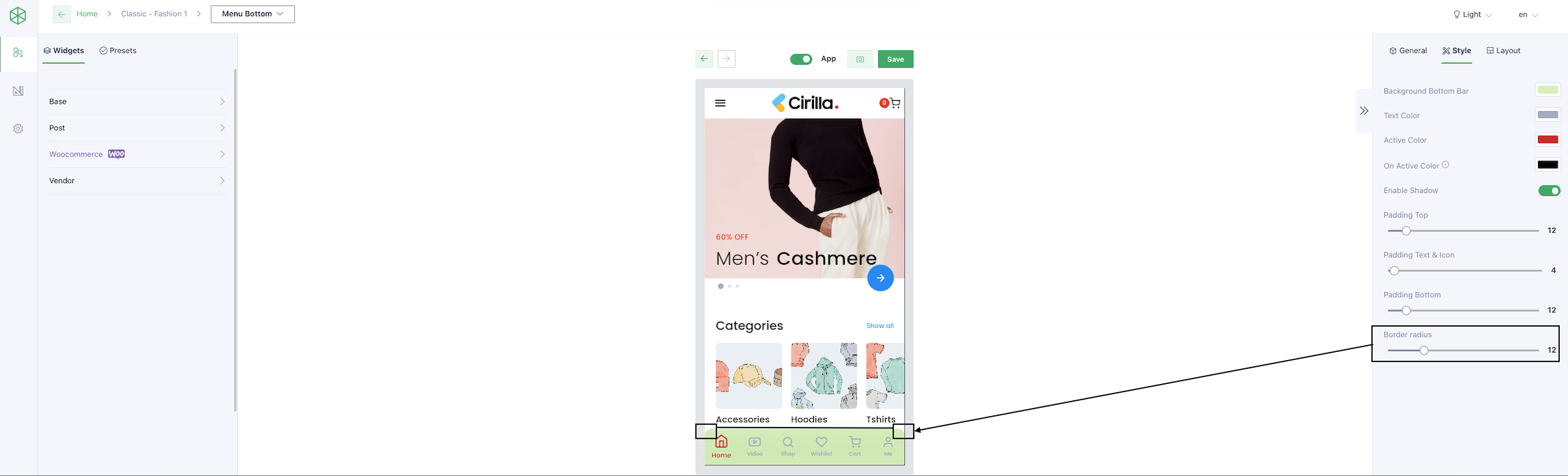
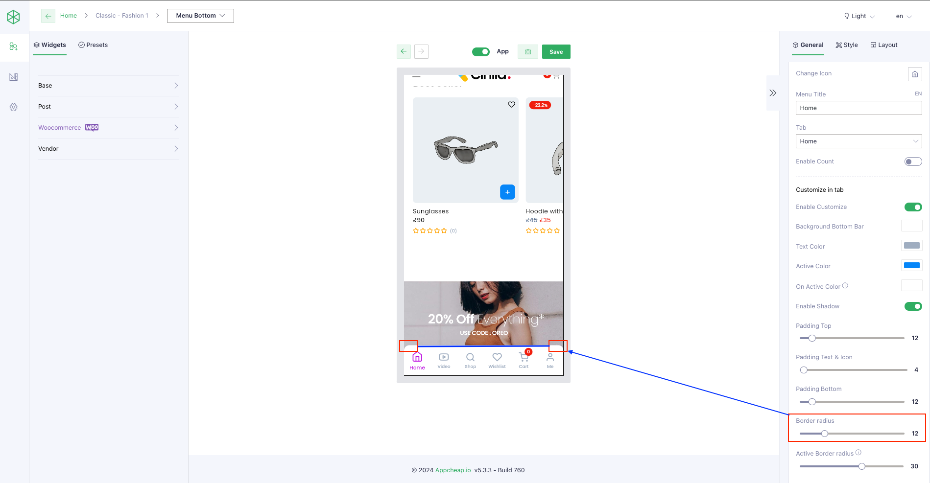
| Border radius | User can set border radius for the menu bottom refer here |
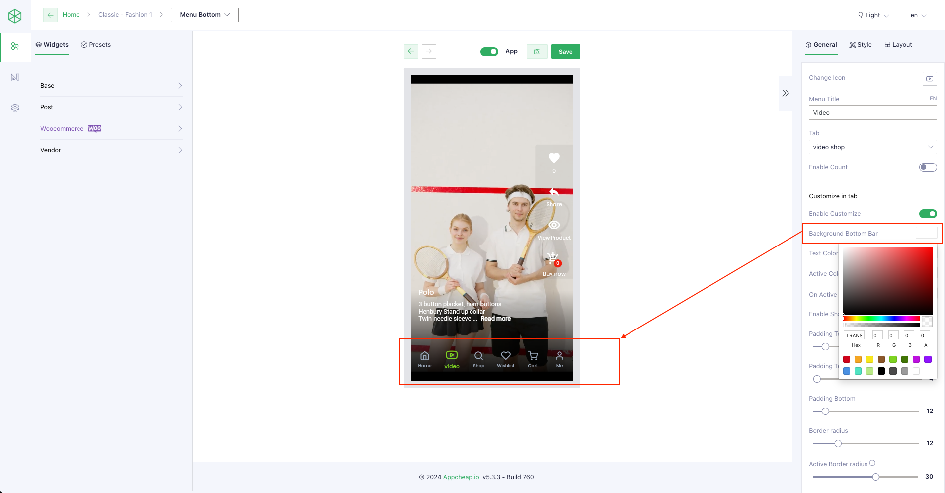
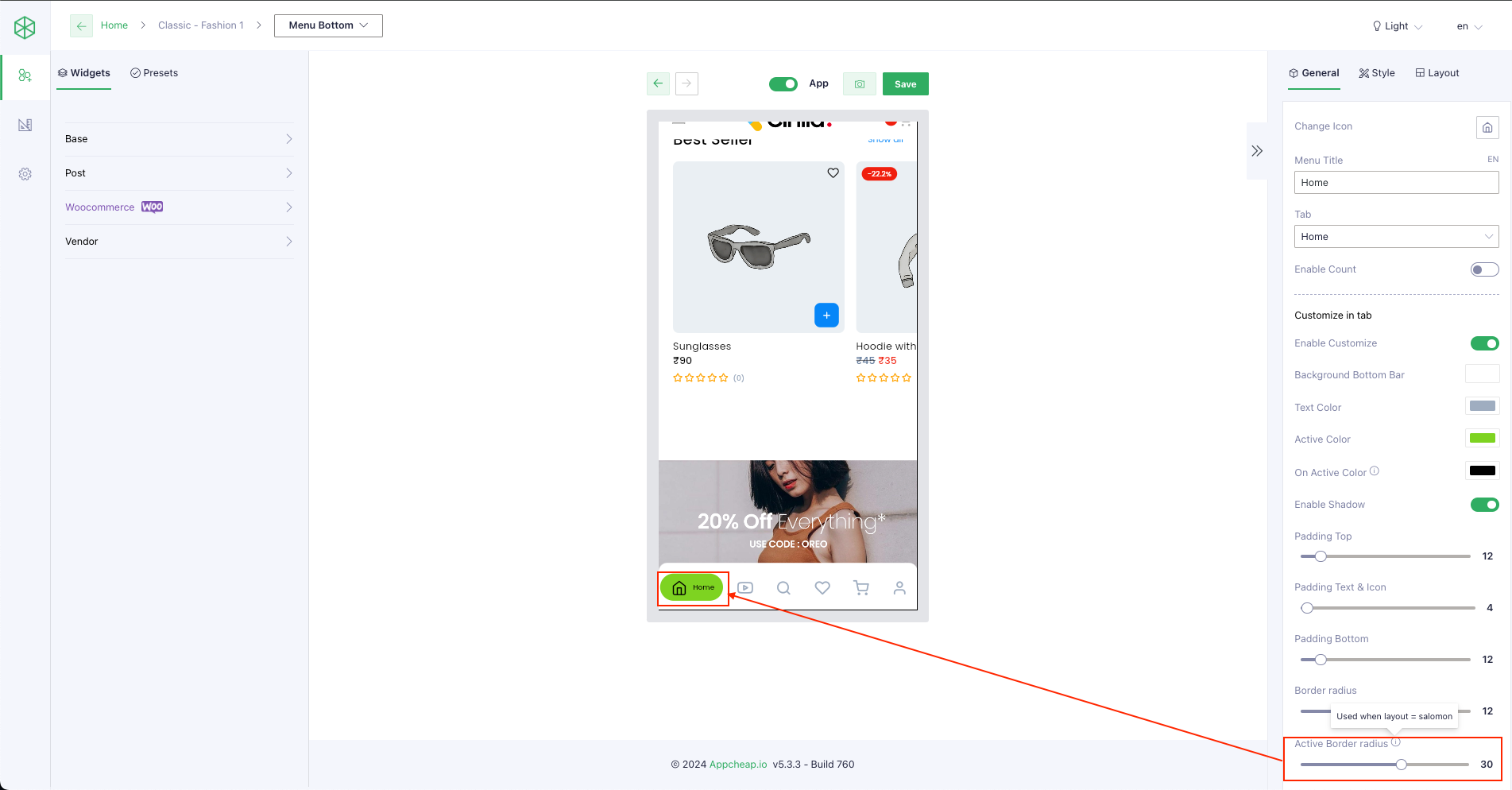
4. Customize in tab
| Enable Customize | true |
| Background Bottom Bar | User can set Background color for this section refer here |
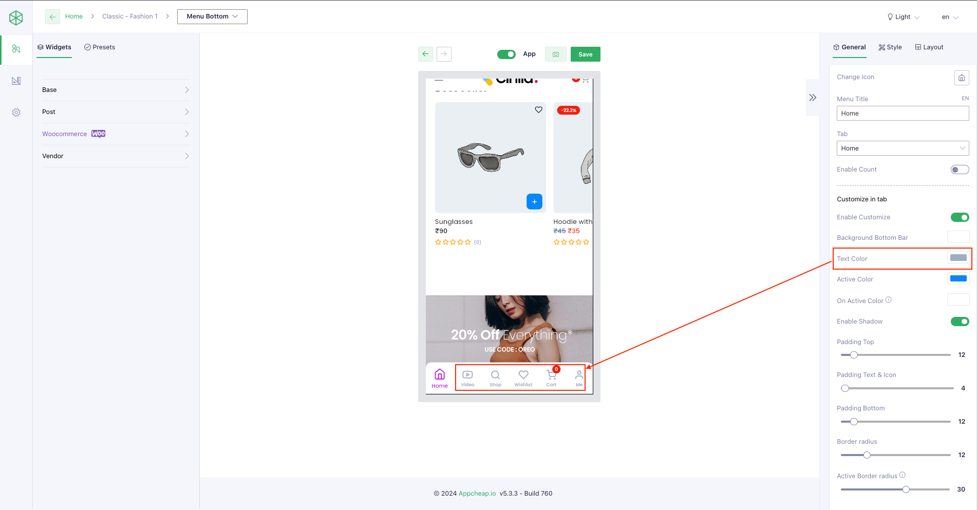
| Text Color | User can set text color for the item refer here |
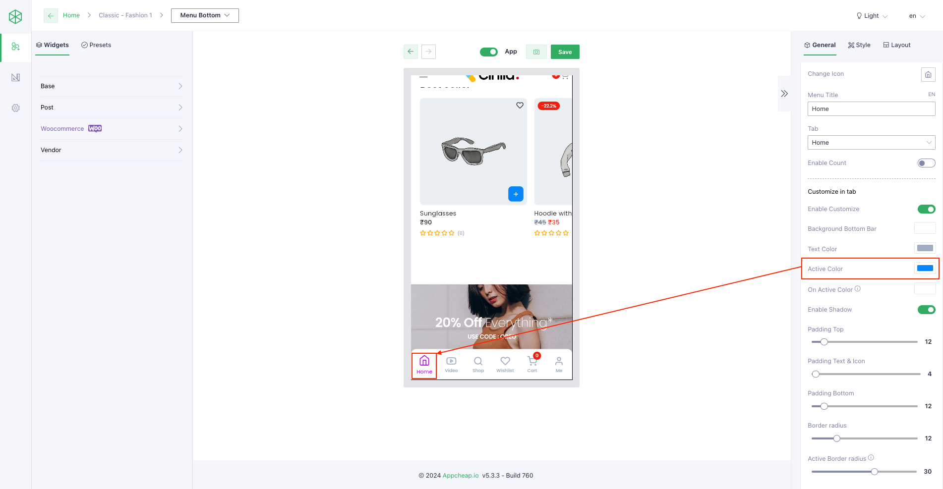
| Active Color | User can set active color for the item refer here |
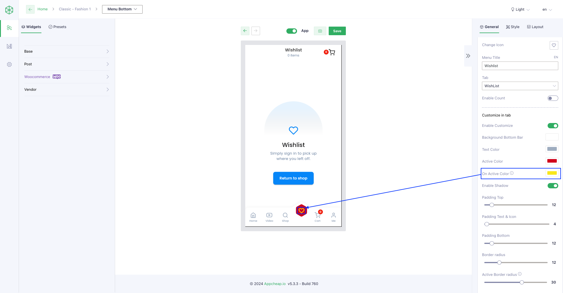
| On Active Color | User can set on active color for the item of layout Salomon Inspired Inside Inspired Inside Hexagon Inspired Outside Inspired Outside Hexago Inspired Outside Deep Inspired Outside Radius Inspired Top Inspired Top Hexagon Creative refer here |
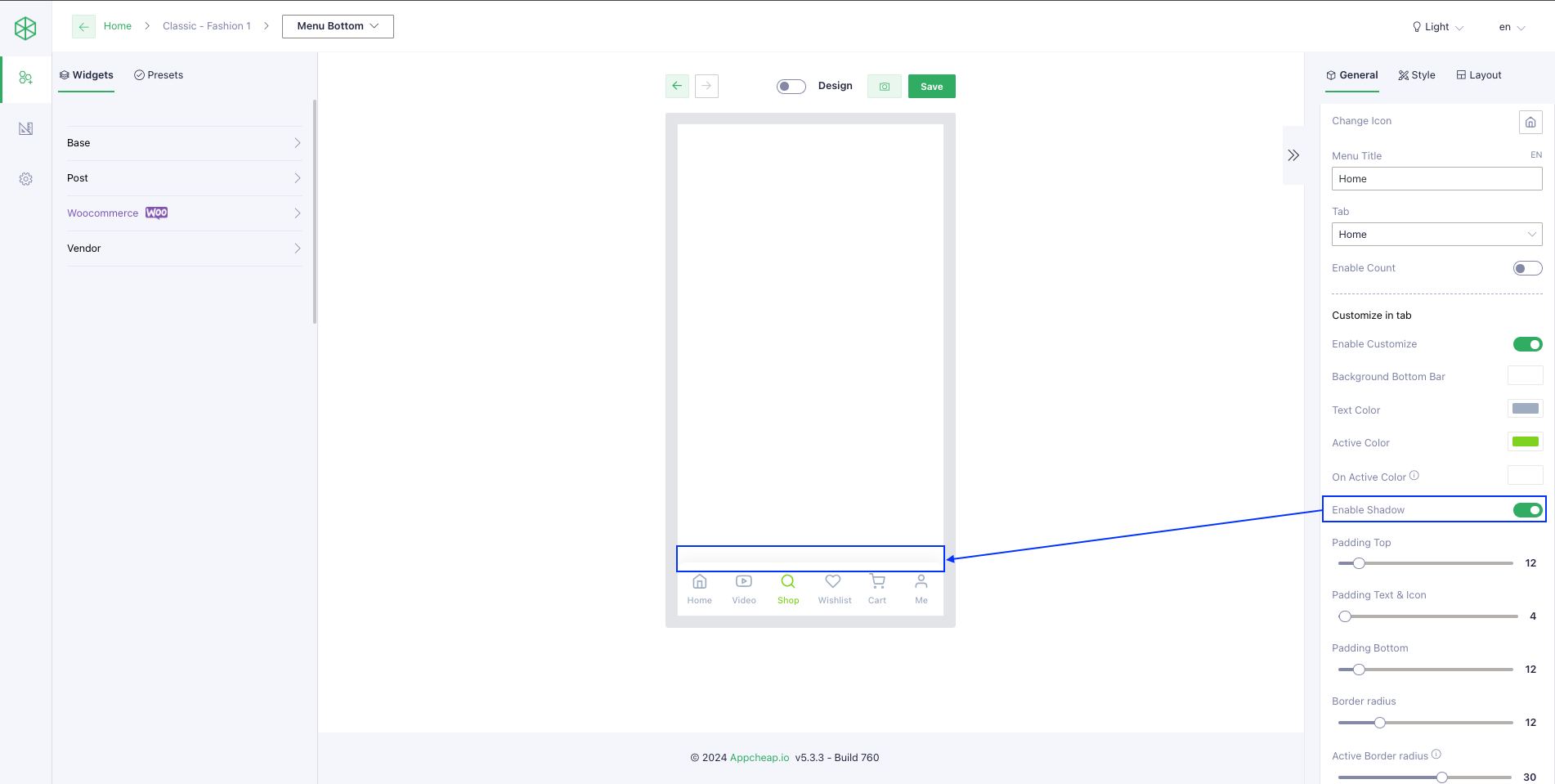
| Enable Shadow | User can enable shadow for the menu bottom refer here |
| Padding Top | User can set padding top for the menu bottom refer here |
| Padding Text & Icon | User can set padding text & icon for the menu bottom refer here exclude layout “salomon” |
| Padding Bottom | User can set padding bottom for the menu bottom refer here |
| Border radius | User can set border radius for the menu bottom refer here |
| Active Border radius | User can set active border radius for the item of layout “salomon” refer here |
4. Activate the default tab
FAQs?
How to active home tab as default tab?