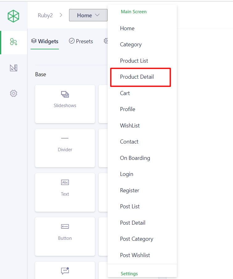
Link to config: Go to Admin panel > choose [App Builder] > Select a template that you want to update > Choose option [Product detail] on the dropdown.
1. Configuration tab
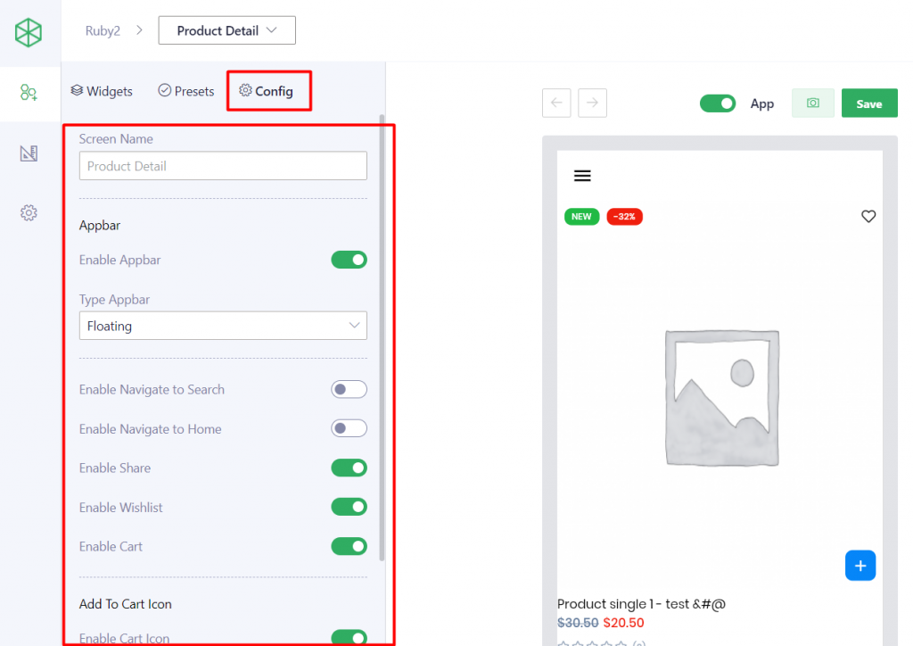
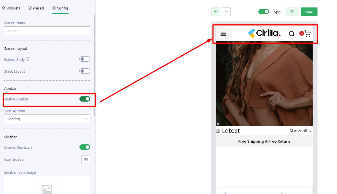
| Appbar | |
| Enable Appbar | Show/hide the app bar refer here |
| Type Appbar | There are 3 types: – Scroll: Appbar will be scrolled following the content – Floating: Appbar will be scrolled following the content BUT when user scrolls back, it will be displayed on the top. – Fixed: Appbar always stays on the top |
| Enable Navigate to Search | Show/hide Search icon Note: this function only works when [Enable Appbar] turns on. |
| Enable Navigate to Home | Show/hide Home icon Note: this function only works when [Enable Appbar] turns on. |
| Enable Share | Show/hide Share icon Note: this function only works when [Enable Appbar] turns on. |
| Enable Wishlist | Show/hide Wishlist icon Note: this function only works when [Enable Appbar] turns on. |
| Enable Cart | Show/hide Cart icon Note: this function only works when [Enable Appbar] turns on. |
| Add To Cart Icon | |
| Enable Cart Icon | Show/hide Cart icon on the bottom menu |
| Type | There are 2 types: – Pined: The cart icon will pine on the left bottom corner of the product image. – Floating: The cart icon always stays on on the center – bottom of the screen |
| Floating Cart Icon Location | There are 18 types to set up the location for the floating Cart icon |
| Bottom Bar | |
| Enable Bottom Bar | Show/hide the bottom bar |
| Enable Navigate to Search | Show/hide Search icon on the bottom bar Note: this function only works when [Enable Bottom bar] turns on. |
| Enable Navigate to Home | Show/hide Home icon on the bottom bar Note: this function only works when [Enable Bottom bar] turns on. |
| Enable Share | Show/hide Share icon on the bottom bar Note: this function only works when [Enable Bottom bar] turns on. |
| Enable Wishlist | Show/hide Wishlist icon on the bottom bar Note: this function only works when [Enable Bottom bar] turns on. |
| Enable Cart | Show/hide Cart icon on the bottom bar Note: this function only works when [Enable Bottom bar] turns on. |
| Add To Cart Button | Show/hide Add to cart button on the bottom bar Note: this function only works when [Enable Bottom bar] turns on. |
| Add Quantity | Show/hide Add quantity function on the bottom bar Note: this function only works when [Enable Bottom bar] turns on. |
2. Set up the Detail product page
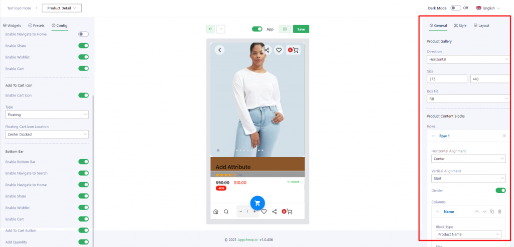
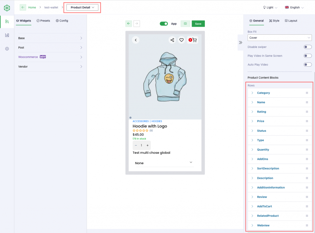
2.1. General tab
Note: On the product detail page, each element will correspond to a row on app builder.
| Product Gallery | |
Direction | Vertical: Image moving direction is set up vertically Horizontal: Image moving direction is set up horizontally |
| Size | Width: set the width of image Height: set the height of image |
| Box Fit | – Fill: The image is resized to fill the given dimension. If necessary, the image will be stretched or squished to fit. – Contain: The image keeps its aspect ratio, but is resized to fit within the given dimension. – Cover: The image keeps its aspect ratio and fills the given dimension. The image will be clipped to fit. – Fit width: the image will be fit width – Fit height: the image will be fit height – None: The image is not resized – Scale Down: the image is scaled down to the smallest version of none or contain |
| Product Content Blocks | The section will include all of elements that will be shown on Product detail page, each element will correspond to a row. |
| Horizontal Alignment | … |
| Vertical Alignment | … |
| Divider | Add more a divider to separate the elements |
| Columns | |
| Block Type | User can choose an attribute that will be shown on the product detail page |
| Flex | … |
| Alignment | Alignment the element: Left, center, right |
| Padding / Margin | Set up the padding/margin for the current row |
| Expand | Set up the default status for description, addition information, reviews: expand or collapse. |
| Foreground Color | Set background color for the current row |
| Add column | This function allows users to add 1 or more Block types on the same row. |
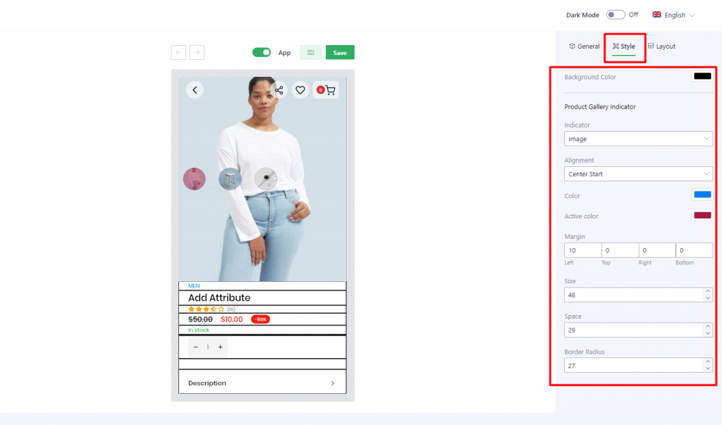
2.2 Style tab
| Background Color | … |
| Product Gallery Indicator | |
| Indicator | Set up the type of indicator: Dot, image, number |
| Alignment | Set up the location to show indicator |
| Color | Set up the color of indicator Note: only apply for Dot, Number type |
| Active color | Set up the color for active indicator |
| Margin | Set up margin for indicator |
| Size | Set up the size for indicator Note: only apply for Image, Dot types |
| Space | Set up space for indicator |
| Border radius | Set up border radius Note: only apply for Image, Number types |
| Active size | Set up the size for active indicator Note: only apply for Dot type |
2.3 Layout tab
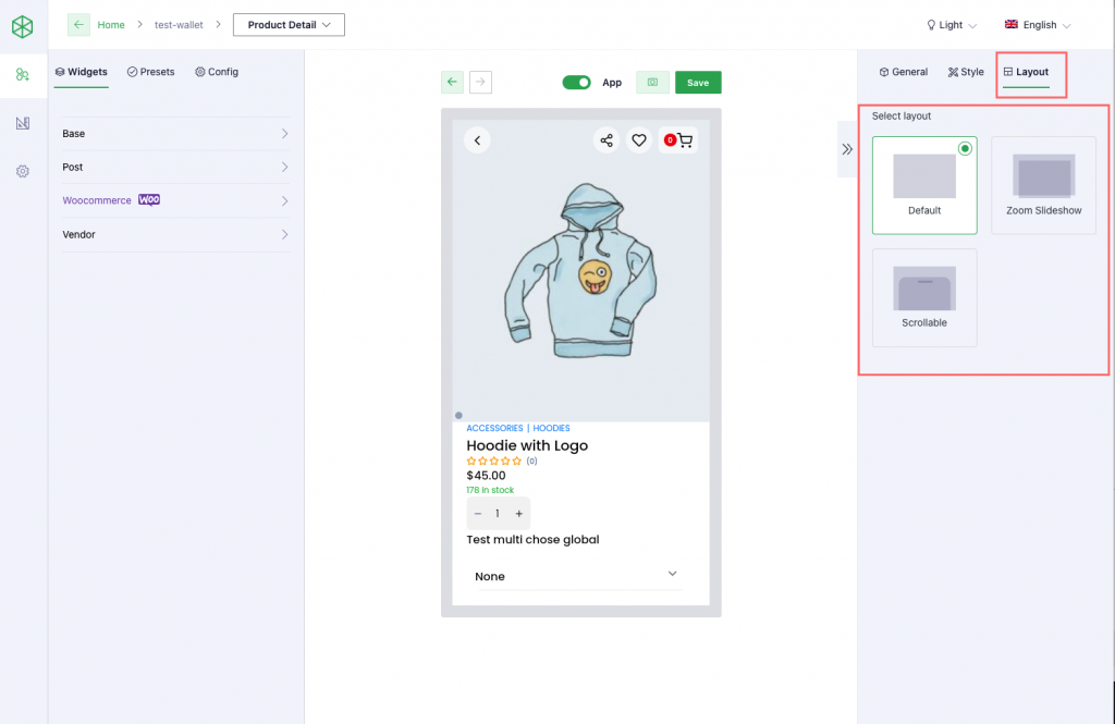
There are 3 available layouts: Default, Zoom slideshow, Scrollable.
Product Query Data
Video guide